WHAT HAS BEEN THE BEST PERFORMING SECTOR IN AUSTRALIA IN THE LAST 12 MONTHS?
Written by: Robert and Russell Markham
There is one sector that has performed head and shoulders above the next best performing sector over the past 12 months. Do you know which sector this is? Park that thought for a few moments yet…let’s get VectorVest to do this for us in a matter of seconds.
What I am about to show you never fails to impress us. We should have been making more use of this powerful graph years ago…and so should you! Let me explain. VectorVest allows for you to benchmark stocks as well as sectors and industries. How would all the sectors stack up if we were to go back 12 months? Let’s get to work to show you how you can have all this at your fingertips each day.
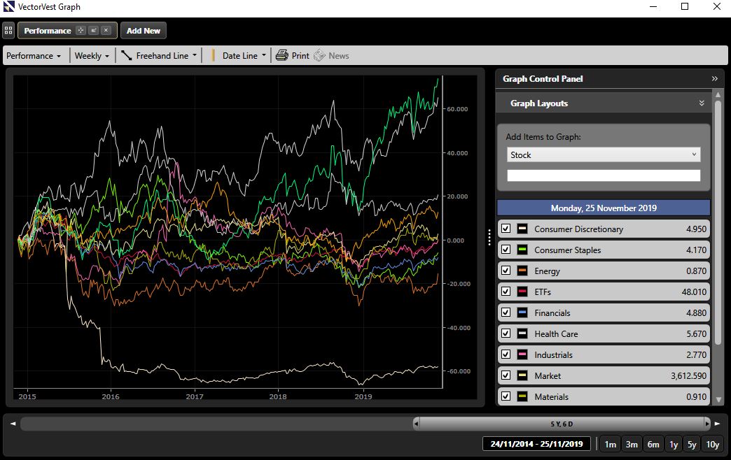
To set this up, firstly click on the Graphs tab. Per the top left of the page where it notes Stocks, click on the dropdown arrow just to the right. Once having clicked on the down arrow, a dropdown menu will appear. Click on Performance. You will now have a Performance Graph Layout with the VV/AU on the Graph (the VectorVest Composite AU which is the average of all the stocks we track). To the right of the page you will see the Graph Control Panel. Under that, where it notes Stock with a down arrow just to the right. Click on the drop-down arrow and select Sector.
Now per the Graph Control Panel, under the Sector selection, click on Choose a Sector and you will now see a list of all the sectors. Click on the first Sector in the list (Consumer Discretionary for me) and this sector will then then be added to your Graph list. Click on Choose a Sector again and click on the next sector. Keep doing this until you have all the Sectors added to your Graph. This can take about a minute…but well worth the effort as we will save this layout, so you never need to do this again.
Once you have added in all your sectors, click on all the white square boxes per your Sector list to add a check mark. Unselect the Market sector and the VV Composite Sector and the VVC/AU as you just want to look at the sectors. Wow, a busy graph, but very telling! The top performing sector as of 19 November is the Information Technology sector. It really has been in a class of its own in recent months. This is then followed by the Health Care Sector and in third place is a tie between Utilities and Materials. Health Care really is surging up fast whereas Utilities seems to be sliding back a bit.
Let’s save this Graph so you do not have to redo this Graph again. To do so, click on Graph Layouts per the top left of the page, and from there, click on Save/Modify Layouts. Click on Add New Layout and name your Graph accordingly. I am going to call it All Sectors. Click on OK and there you have it. The Layout is now saved so you can access the Graph view in just a few clicks of the mouse each day.
Next time you are in the Performance Graph, you can click on Graph Layouts and locate your saved Layout and other Layouts you may want to create!


Leave A Comment